Edit your white-label sign-in page
The sign-in screen is the first thing anyone sees on your domain, and by default it carries our wording. These four fields make it yours. Leave any of them empty and ours stays.
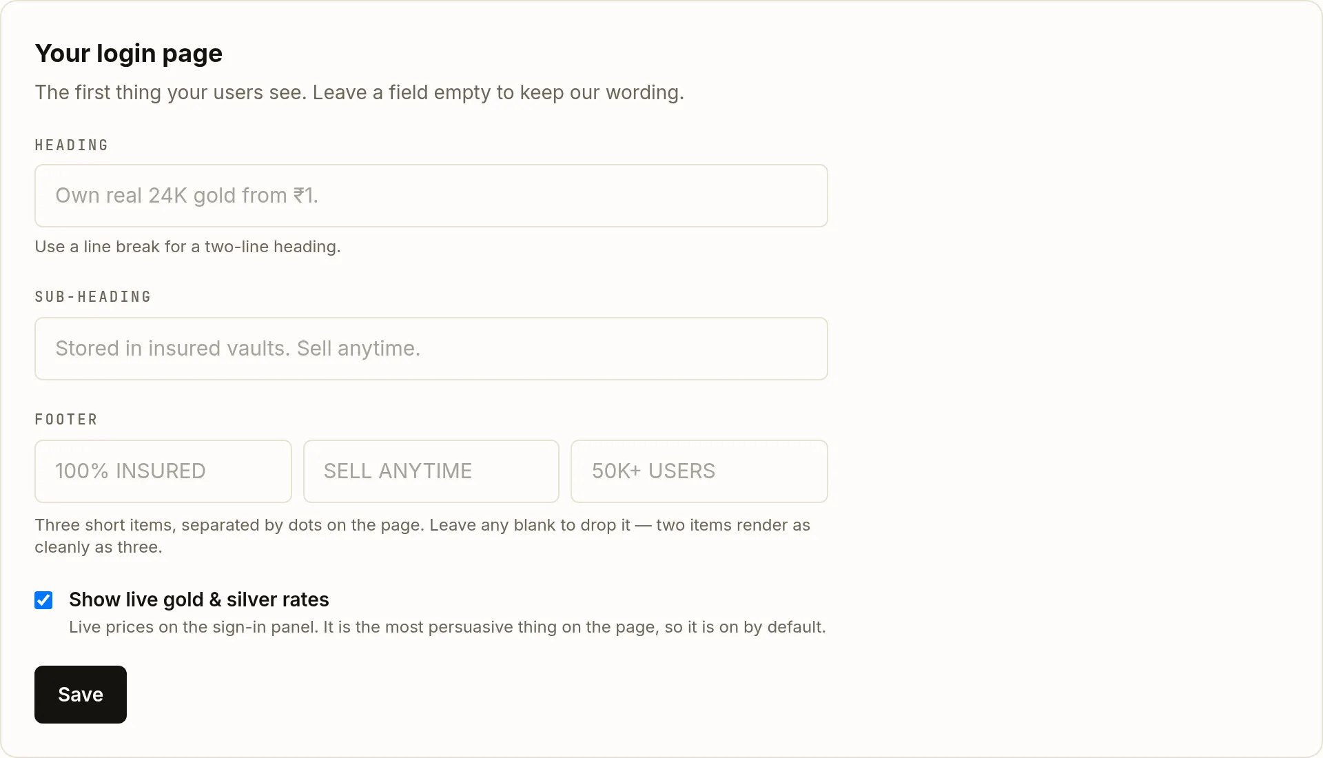
The third card on the Whitelabel page is Your login page.
| Field | Type | Description | |
|---|---|---|---|
| heading | string (120) | optional | The main line. A line break renders as a two-line heading, which usually reads better than one long one. |
| subheading | string (160) | optional | One supporting sentence under the heading. |
| trust | 3 × string (40) | optional | Three short items rendered along the footer, separated by dots. Leave one blank to drop it — two render as cleanly as three. |
| show_rates | boolean | optional | Live gold and silver prices on the sign-in panel. On by default. |
Write the heading
Say what someone can do, in their terms. The default is a concrete offer rather than a category description, and it is worth keeping that shape — a heading that names a minimum amount tends to outperform one that names a product.
Write the sub-heading
One sentence answering the obvious next question — where the metal actually is, and whether they can get their money back out.
Fill in up to three footer items
Short, factual, 40 characters each. These carry the reassurance, so make them claims you can stand behind rather than superlatives.
Copy longer than the limit is trimmed, not rejected. Nothing errors — you just find your sentence cut short on the live page. Count the characters.Decide about live rates
The Show live gold & silver rates checkbox puts current prices on the sign-in panel. It is on by default because it is the most persuasive thing on the page: it shows the product is live and priced before anyone has signed up.
Saving, and what review means here
Before your domain is live, Save applies your copy immediately. Once you are live the button becomes Submit copy for review, the new wording is staged, and your site keeps serving the approved version until an administrator accepts it.
This uses the same staging lane as your brand assets, and for the same reason: reviewing a heading must never be able to take your domain offline.
Writing for the screen it actually renders on
Full branding shows at 1024 pixels and up. On a phone the layout collapses, so the heading does most of the work and the footer items are the first thing to be squeezed — which is a good argument for two strong items over three weak ones.